Lake Como

I’ve just returned from a weeks family holiday to Lake Como. We stayed at a beautiful villa looking over the central section of the lake. Apart from a day of rain the weather was perfect and we visited many beautiful places around the lake. We even went to Milan for the day to see Di Vichi’s ‘Last Supper’ and the stunning cathedral.

From a sketching point of view I didn’t find much time to paint but the view from the villa’s terrace had to be drawn….

Como1

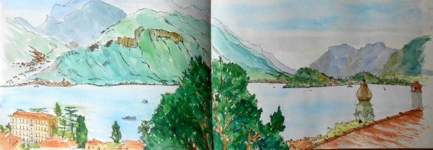
View from Villa Cesare (well about half of the view)

The other half of the lake view was sketched as a quick postcard, on tricky paper.

Como5

We visited a stunning villa on the lakeside called Villa del Balbianello, used as locations for Star Wars and James Bond. While the others went round the house I sat on a terrace and sketched the loggia

Como2

The last of my sketches were on the final day, looking at lakeside towns we had visited earlier that day, from the villa terrace. These are pencil and wash and I’m pleased with the way they both look on the page.

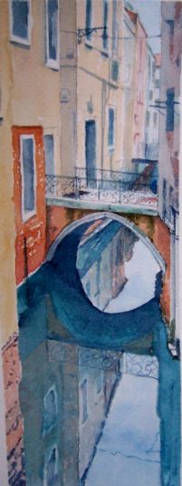
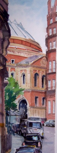
I took a lot of photos and plan to make paintings from them, which I will show in this blog when done.

Trying different methods

I’ve been thinking of trying acrylics or oils for a while and wanted to see if I had learnt from working with my watercolours.

I found an image of Limone, Lake Garda, from last year and liked the light on the water and buildings. I made a pencil drawing first to get accustomed to the tonal range and details in the picture.

Limone 3

Limone, Lake Garda, Italy, Pencil

With the simple sketch worked up I found some acrylics passed on to me by a friend who did not want them anymore. I bought some cheap acrylic brushes so that I didn’t ruin my watercolour ones. Working with acrylics is the opposite to watercolours, so I started with the darks and worked towards the lights.

Limone 1

Acrylic 

I was pleased with aspects of the painting and could achieve far deeper colours than with watercolours, where they tend to go muddy if worked too much. I like the way highlights can be added to good effect with acrylics. But blending was much trickier and getting the sky to work was so much harder compared to watercolour. Having finished the acrylic painting I then worked on a watercolour version.

Limone 2

Watercolour

The sky and mountain areas were painted in minutes, with translucent light and blended colours easily achieved. The treeline presented more of a challenge as I can change and adapt with Acrylics but watercolours are much less forgiving. I had to get it right first time. The depth of the water and buildings are less with the watercolour but I feel I can get more accuracy with them. (notice for some strange reason I’ve added another building to the watercolour version)

Verdict. I think the simple pencil sketch has charm.The acrylic is fine for a first attempt but needs more thought and the watercolour is fresh. Feedback welcome.

Goring Sketching Trip

I joined a sketching trip to Goring on Sea last week and produced this on the beach, under a very hot sun. I’m pleased with the outcome as painting people is very tricky. See if you can see the baby paddling in the sea with here mother.

line and wash

Goring on Sea


Sold! Pintar Rapido 3rd year running

For the third year running I sold my entry at Pintar Rapido. This annual competition based in Chelsea attracts many professionals and amateurs (including me, 3 years running) with the main remit of painting a London scene in a day. The following day they are exhibited at Chelsea town hall.

Numbers were down again this year and the number of sales was even lighter. I decided to return to the river and take on Albert bridge again. Its a lovely setting and close to the town hall.

It turned out to be a beautiful day but painting outdoors, with the aim of producing my best work, is a real challenge. I normally only sketch outdoors. Changing light and tides, drying winds, hot sun and traffic pollution all added to the task. It was just as well that I had practiced the scene at home…as this helped me overcome many issues as I painted.

photo (5)

I was pleased with the outcome in the end and chuffed that someone bought it!

Here it is framed.

pr2016

Albert bridge from Chelsea Embankment

Even more Venice

Venice carries on inspiring me and I’m continuing to work on new studies. I’m trying different compositions and techniques to see what is successful.

The top image is of a rather grand but weathered entrance, leading off a narrow canal. The windows have been bricked up and then grills attached. I wonder why.

Below is a picture of a canal leading into the Grand canal. I could navigate through the city by recognizing the brighter light coming from the Grand Canal and lagoon. I wanted to capture this effect with lights and darks.

venice11

Venice

Finally, I’ve produced another long, thin painting to go with the others, from a previous post. I felt the painting with the tree was in a different style and I needed another image to make up the triptych. I’ve framed the three paintings now and they look great together.

Venice12

Pintar Rapido tomorrow… I’m preparing for the day’s painting and hope it goes to plan.

Last of Venice, for now

My final two pictures of Venice couldn’t be more different in style. Both are very busy pictures but treated in different ways. One has harder shadows,stronger colours and much more close-up detail. The other is more romantic, has a wider vision and is much looser in style. Of course I’m critical of both and wondering if there is a happy medium but for now I will study and learn from them and move on.

I walked to the Ponte dell’Accedemia and was hit by the most amazing view of the Grand Canal. I took photos and knew I had to try and paint the view towards the Basilica.

Venice 9

Basilica di Santa Maria della Salute

The other painting is of a canal scene somewhere in Venice. Loads going on, great reflections and all the things I like to paint; boats, bridges and water.

Venice 6

Venice

Views of Venice

With the beautiful city of Venice still fresh in my mind I’ve been working on some new paintings. I was given a pad of lovely Arches watercolour paper by a good friend and being long and thin they are the perfect size for views of the canal. It’s wonderful paper to work with and makes a big difference on layering washes and merging colours.

Given the paper size I looked through my photos and found three views I felt I could work on. The first is one from my sketchbook and shows a scene across the Grand Canal to a bridge with people wandering over it with umbrellas/parasols. (My camera has distorted the verticals I’m afraid)

Watercolour

Parasols in Venice

The next was of a dark sided canal with an old boat moored up and a bridge in the distance, close to our hotel.

Venice 9

Finally the water in Venice has a greeny,blue colour in certain lights, close to Veridian and I found a picture that captures the colour and mood of the place. The camera has taken some of the green out of the picture but I like the overall result.

Venice 7

Venice reflection

I’m thinking of grouping the three paintings onto a single frame as they work well together. (verticals are off as the paper has curled)

More paintings to come of Venice but I’m also planning for this years Pintar Rapido. As I’m working with this lovely paper I thought I could use it for the competition. I made a quick study of the Albert Hall and produced this… what do you think? Worth a try on the day?

Albert hall

Venice Sketches

I’m back from a wonderful 3 days in Venice. A mixture of dancing, art, food and drink. It’s a beautiful city, with so many stunning views. We did get some rain, which cut into our dancing, as it was all outdoors. There was also flooding from very high tides and sunshine on the final day… all adding to the atmosphere of the place. But I did get to dance to an orchestra in St Mark’s Square, briefly.

I found time to sketch with varying results. The big picture never happened. I went out with good intentions but couldn’t settle and made a mess of it. So I kept to small sketches in my watercolour pad. I’m reminded..it’s very difficult to sketch on the spot.

I did take photos of promising views and it’s inspired me to work on a new range of paintings.

Quick sketches of Venice

Venice sketches

We stayed at a great hotel, which had a landing stage facing out on to the Grand Canal, where we enjoyed drinks in the evening. Stunning! From this wharf I found time to sketch a small scene on the opposite bank, during which there was a small shower or rain. (see umbrellas)

Venice 16 2

Off the Grand Canal

Other sketches..

Venice 16 3

View to St Mark’s & Doges Palace

Venice 16 5

Unfinished canal scene (possible future painting)

Venice 16 4

Campo Dei Frari

Another attempt at Venice

Well I’ve found out that I can’t turn into a professional painter, with 30 years of experience, after copying just one of his paintings!

It’s really difficult to think how to take his methods and style on to another subject. I used the previous location in Venice and changed the angle and composition slightly. I tried to apply his style of painting to the familiar scene but nothing worked first time. This leads to a muddy result. I felt like giving up so many times but pressed on.

It’s very different from my usual style and I’ve learnt a lot but I think I need another 29 years to get it right.


venice4

I’m off to Venice tomorrow and will be sketching and roaming around looking for more inspiration.

I’ve just found out that Zbukvic has painted this very scene and it will be interesting to see what his version looks like!!